Proline Dashboard Design
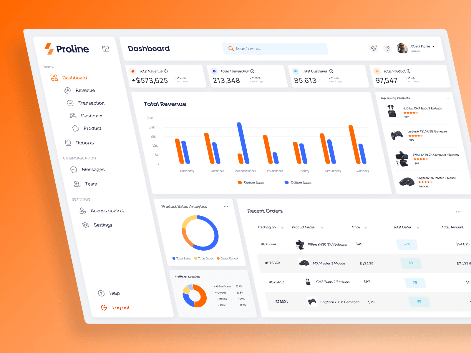
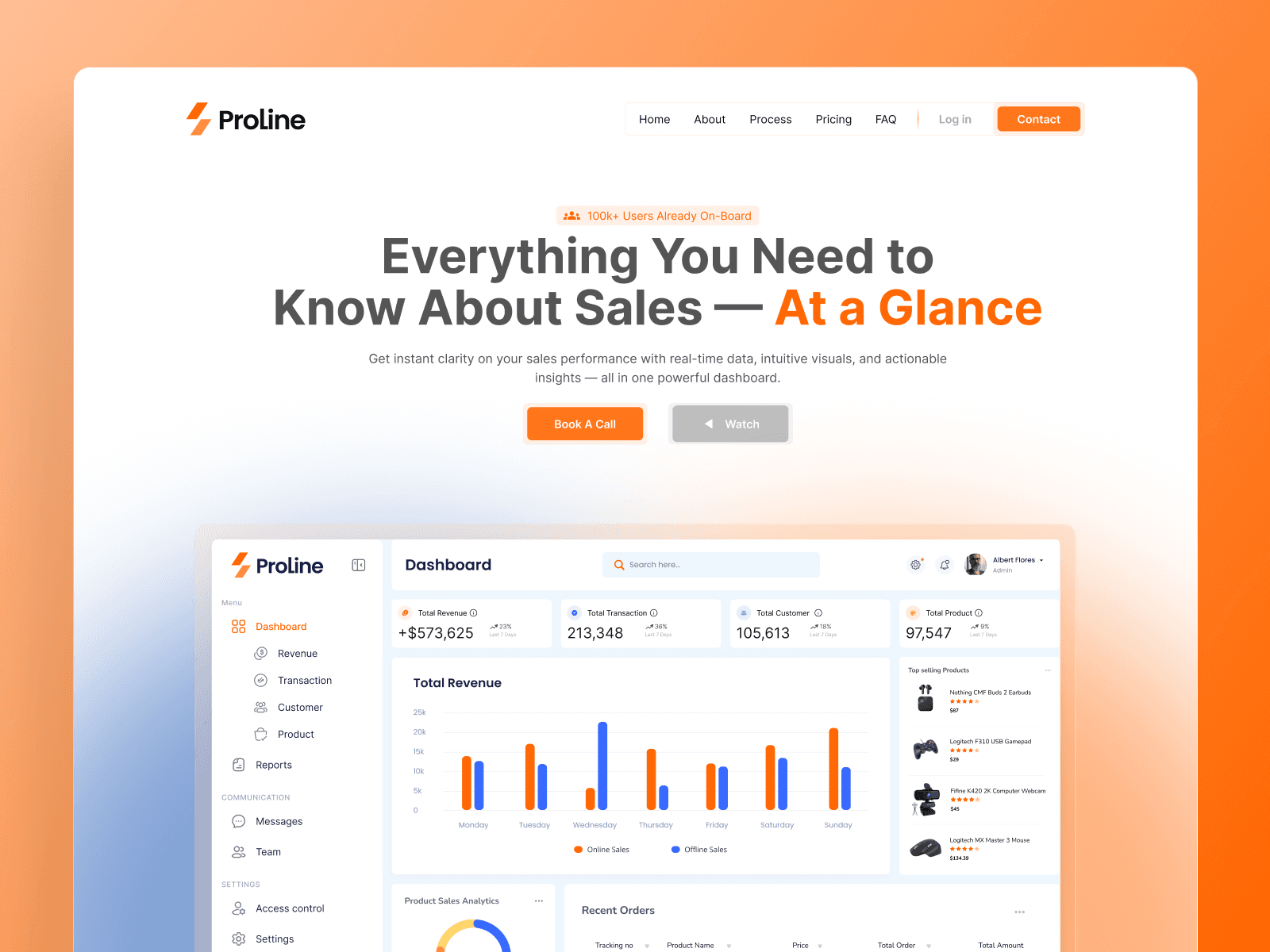
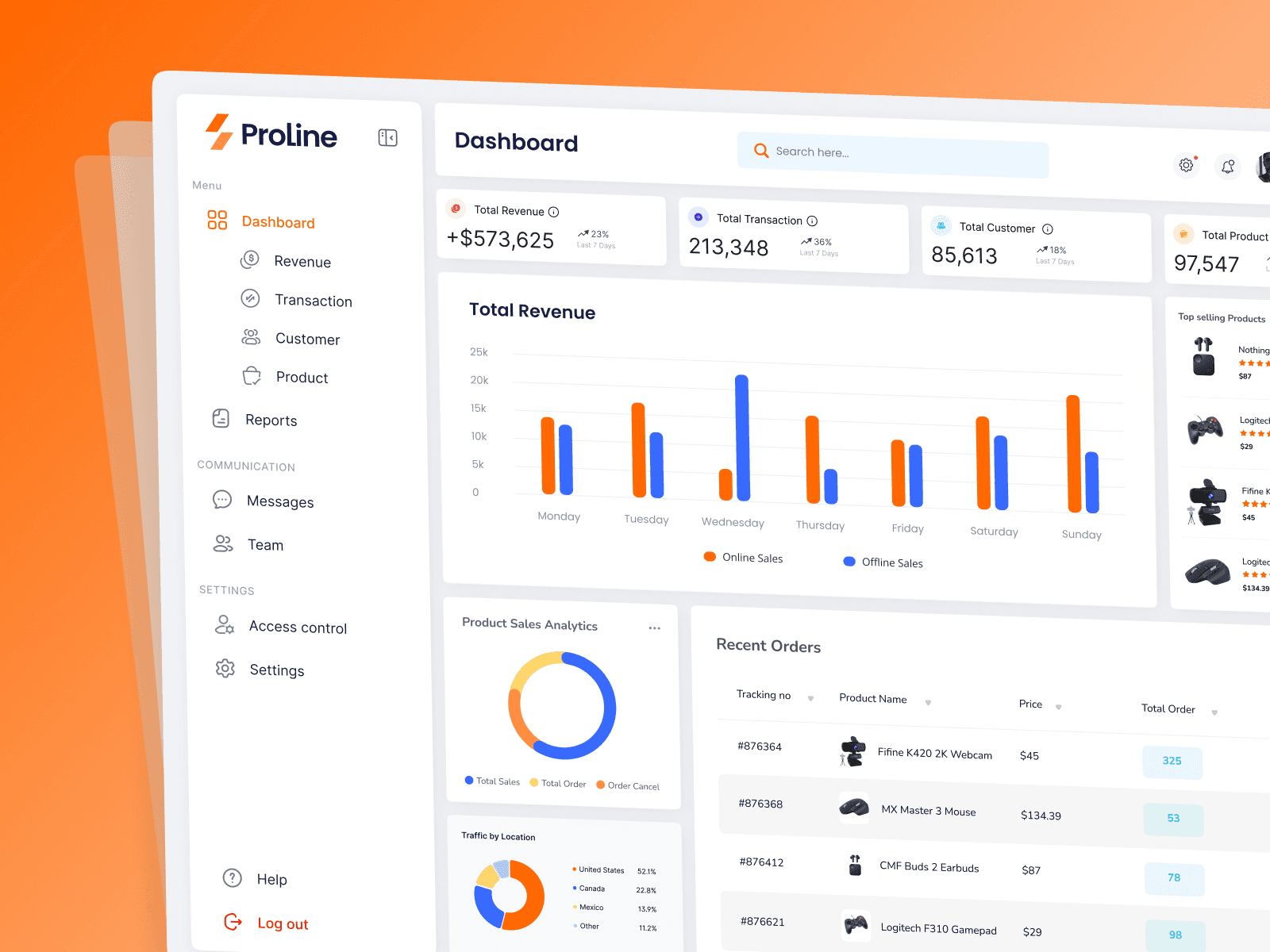
Complex analytics platforms often overwhelm users with cluttered data. For Proline, the goal was to take heavy sales insights and structure them into a clean, high-clarity dashboard. I focused on intuitive visual hierarchy and modern UI principles to ensure key performance metrics are effortless to read and track at a glance.
Highlights: Clean visual hierarchy, intuitive data components, frictionless layout
Tech & Design: UI/UX Design, Framer Development
Year :
2025
Industry :
SAAS
Client :
Studio Prism
Project Duration :
4 weeks


More Projects
Proline Dashboard Design
Complex analytics platforms often overwhelm users with cluttered data. For Proline, the goal was to take heavy sales insights and structure them into a clean, high-clarity dashboard. I focused on intuitive visual hierarchy and modern UI principles to ensure key performance metrics are effortless to read and track at a glance.
Highlights: Clean visual hierarchy, intuitive data components, frictionless layout
Tech & Design: UI/UX Design, Framer Development
Year :
2025
Industry :
SAAS
Client :
Studio Prism
Project Duration :
4 weeks


More Projects
Proline Dashboard Design
Complex analytics platforms often overwhelm users with cluttered data. For Proline, the goal was to take heavy sales insights and structure them into a clean, high-clarity dashboard. I focused on intuitive visual hierarchy and modern UI principles to ensure key performance metrics are effortless to read and track at a glance.
Highlights: Clean visual hierarchy, intuitive data components, frictionless layout
Tech & Design: UI/UX Design, Framer Development
Year :
2025
Industry :
SAAS
Client :
Studio Prism
Project Duration :
4 weeks